The riskiest part of a design-led website is usually not the design. It is the distance between the approved Figma file and the site that goes live.
That is where spacing drifts, a layout gets improvised on mobile, the CMS ends up as something only a developer can use, and the client looks at the launch and feels it is a bit less than what they approved. For a studio, that gap is the whole relationship: trust, margin and the next project.
I have been building other people’s designs for 25 years, for companies and for agencies. This is what I have learned about where the quality goes, and what I do about it.
Quality is lost in small decisions
Nobody decides to build a site badly. A section gets built quickly instead of as a component. A grid works on desktop and collapses at 900 pixels. A CMS field is added without thinking about how an editor will reuse it. Images go up at export size. Motion is added in the last week. Metadata is a launch-day task.
None of these looks like a problem on its own. Together they are the difference between a site that resembles the design and one that is finished.
| Small decision | What it costs later |
|---|---|
| A section built quickly instead of as a component | Every change made in several places |
| A grid that works on desktop and collapses at 900 pixels | A layout improvised on tablets |
| A CMS field added without thinking about reuse | Editors improvising, or waiting for a developer |
| Images uploaded at export size | Slow pages |
| Motion added in the last week | Animation that feels added on, not designed |
| Metadata left for launch day | Pages search engines read badly |
Fidelity is not pixel-matching
Building what was designed does not mean copying the artboards. It means understanding what the design is protecting: hierarchy, rhythm, contrast, density, how the interface should behave at widths the file does not show.
Most of the decisions that matter are not in the Figma file. How a long headline wraps. How an image crop survives real content. What a component does when the client adds a fourth item to a row designed for three. I make those calls in the design’s own system, and I tell the designer which screens I added so nothing is a surprise.
The CMS is part of the design
For a content-managed site, the CMS is one of the ways the design survives contact with editors. Fields that are too vague and editors improvise. Fields that are too rigid and the site becomes frustrating. Components that are too flexible and the visual system falls apart in six months.
Setting up the control panel for the people who will actually use it is design work, and it is the part most studios do not see until the client complains.
Worked example: NCREP
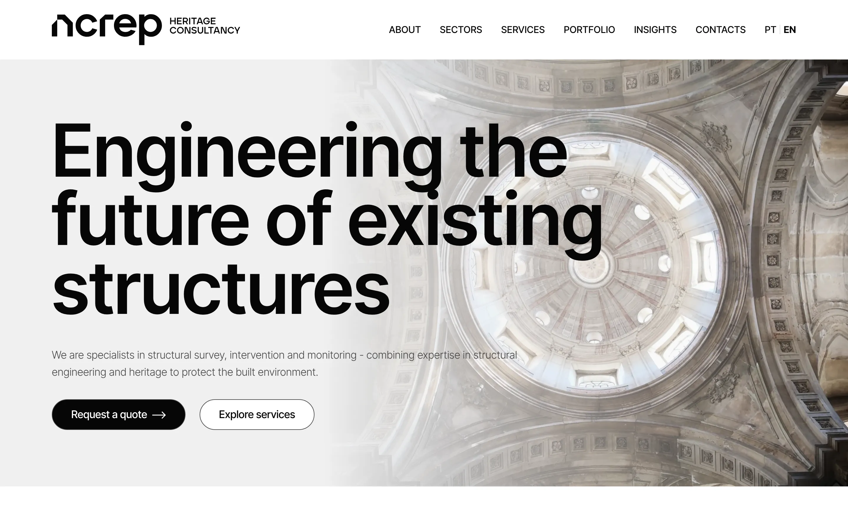
NCREP is a heritage consultancy. Major, an agency I have worked with on several projects, led the client relationship and the design: two sites, one visual system, one of them in two languages.
Major brought me in before there was a design, to decide the platform. What the project needed was: one Craft CMS installation running both sites, a content model that let the client’s team manage them from one login, and custom modules for the parts the design called for and the CMS did not have out of the box. Four months from discovery to launch. Major presented it and I answered for the technical side.
The point of the example is not the stack. It is that the gap closed because the technical questions were asked at kick-off, not after the designs were signed off.
Responsive behaviour needs judgement
Stacking everything on mobile is not responsive design. The hierarchy, the spacing and the reading rhythm have to hold at the sizes real visitors use, and that sometimes means changing the order of elements, using different crops, or shortening a label.
The goal is not to preserve the desktop layout at all costs. It is to preserve what the design meant.
Motion needs restraint
Motion can make a site feel finished, or heavy. The right animation supports attention. It does not decorate every interaction. It respects reduced-motion settings and the fact that people are trying to read.
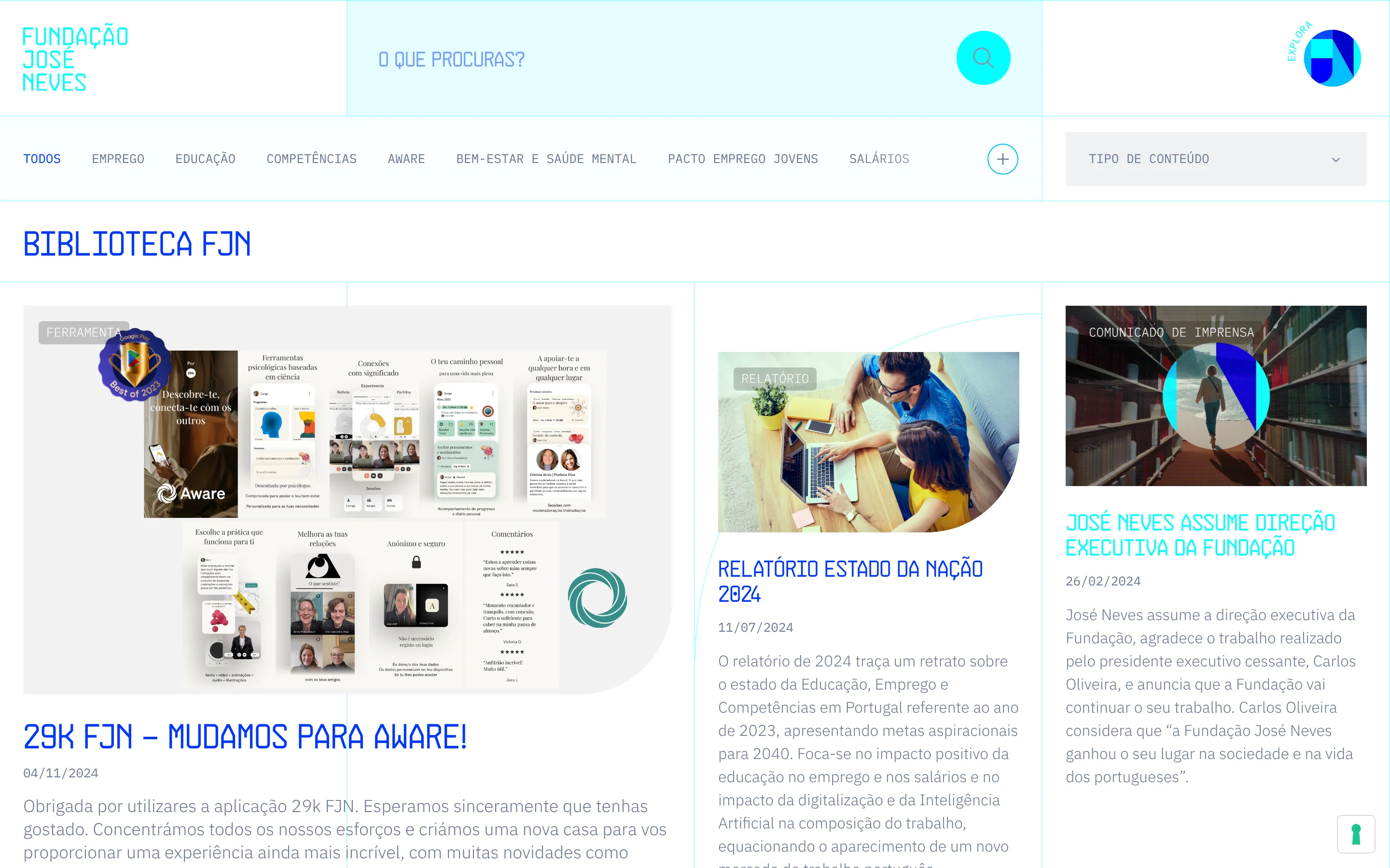
José Neves Foundation came with an animation language already established on their old site. Keeping it through a rebuild and a 250-page migration was most of the work, and it is the reason the client did not notice the platform had changed.
Launch quality is built all the way through
Performance, accessibility, redirects, image handling, forms, analytics and sitemaps are not a final checklist. They are the result of how the build was handled from the first week. One Webflow site I was asked to fix looked finished and had 1,321 unused classes and a 21 MB page underneath. Two weeks of clean-up took the worst page from 52% to 97%. That work is cheaper to do during the build than after.
What to expect from the developer
If you run a studio and bring in a developer, these are reasonable things to expect, in this order:
01
Review before the quote
The designs reviewed, the expensive or fragile parts flagged, and a platform recommendation your client understands.
02
Build in the design's system
The gaps in the design filled in its own system and named, and a CMS set up for the client's editors.
03
QA on real devices
Every template checked on the phones, tablets and browsers people actually use.
04
Handover
A documented handover, then thirty days of fixes after launch.
That is what I do, white-label or alongside you. The agencies page has the two ways it can work and what it costs.
For agencies and designers
White-label, or alongside your studio.